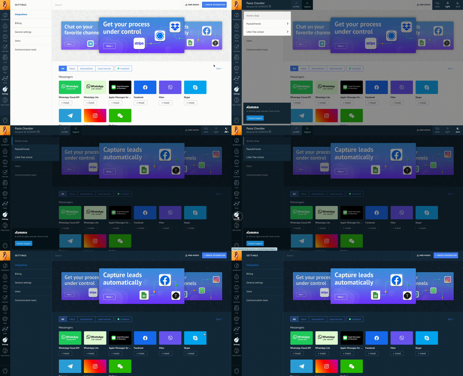
Dark Theme
If you click on your profile avatar located in the upper left corner of the screen, an option to choose the interface theme will appear in the right corner: light or dark. You can manually select a theme or set automatic switching to activate the dark theme based on your operating system settings.

The dark theme in Kommo allows users to customize the interface according to their preferences. To integrate successfully with the dark theme, it's essential to use predefined CSS variables and follow specific rules to ensure design consistency.
Using Variables in Dark Theme
Dark theme in Kommo relies on the use of variables that are declared in CSS. These variables provide the ability to customize the colors and styling parameters of the interface. To access these variables, you need to refer to the layout in Figma, where they will be described and demonstrated in detail.
Example
Here we use an input field as an example.


.input {
  color: var(--palette-text-secondary-dark);
  border: 1px solid var(--palette-border-default);
  background-color: var(--palette-background-primary);
}
Rules for Developers
When developing integrations with Kommo dark theme, we recommend to follow the rules:
- Use the provided variables to ensure consistency and avoid conflicts, but if you have corporate colors, you can use custom variables.
- Do not override predefined variables. This helps maintain style consistency and avoid incompatibilities with system updates.
- Use variables only for corresponding elements (e.g., text variables should only apply to text elements).
Custom Variables
Support for dark and light themes is implemented via the data attribute in the HTML tag [data-color-scheme="dark"]. The system uses color variables declared through :root. You should create unique variables by incorporating your widget's code into the variable name.
Example of custom variables for colors
:root {
  --example-code-widget-color-white: #ffffff;
  --example-code-widget-color-anti-flash-white: #f2f2f2;
  --example-code-widget-color-cultured: #f5f5f5;
  --example-code-widget-color-onyx: #363b44;
  --example-code-widget-color-dark-gunmetal: #0f2231;
  --example-code-widget-color-spanish-gray: #92989b;
  --example-code-widget-color-dark-silver: #6b6d72;
}
When defining variables for background and text, use existing color variables. In special cases, it's acceptable to use colors without variables.
Example for Light Theme
:root {
  --example-code-widget-text-primary: var( --example-code-widget-color-onyx); /* text */
  --example-code-widget-background-default: var(--example-code-widget-color-cultured); /* background */
  --example-code-widget-overlay-background-primary-600: rgba(255, 255, 255, 0.6); /* background special case */
}
Example for Dark Theme
In a dark theme, you need to use the data attribute.
:root[data-color-scheme="dark"] {
  --example-code-widget-text-primary: var(--example-code-widget-color-anti-flash-white); /* text */
  --example-code-widget-background-default: var(--example-code-widget-color-dark-gunmetal); /* background */
  --example-code-widget-overlay-background-primary-600: rgba(0, 0, 0, 0.6); /* special case for opacity*/
}
Updated 11 months ago